


I’m occasionally asked what my dream illustration job would be (usually by my kind and helpful agents, attempting to point my career in some sort of direction), and I truly never know how to reply. I jokingly (truthfully) say that I want to work with people who will be nice to me and pay me lots of money.
It has never occured to me to say that I’d like a film director to ask me to do all of the title lettering for their new film, because that would be ridiculous.
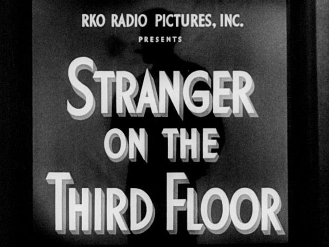
Nevertheless. Azazel Jacobs first got in touch with me after I illustrated a review of his film French Exit for The New Yorker. He was kind enough to say that it captured the tone of the film, which was wonderful to hear; it’s always a frightening thought that whoever you are illustrating in The New Yorker will probably actually see it in real life (yikes) and likely not feel fully captured by it (argh).

A year or so later I heard from Azazel again, when he was finalising work on his latest film His Three Daughters and needed the title lettering redone - in about a week - before sending the film to Toronto Film Festival for its premier.
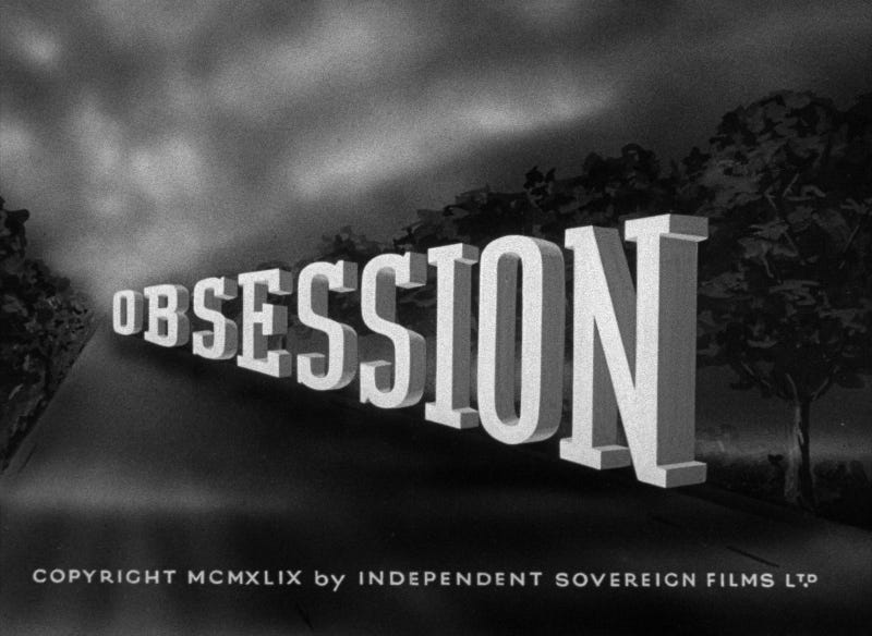
The main brief for the lettering was that it should be inspired by the hand rendered title cards of 1930s and 40s films, something I’ve loved since I was a teenager making VHS recordings of the old films that BBC2 used to hide away at 2:35am. The end of the films would often be cut off thanks to overrunning golf or something, but at least those spectacular titles were always intact.
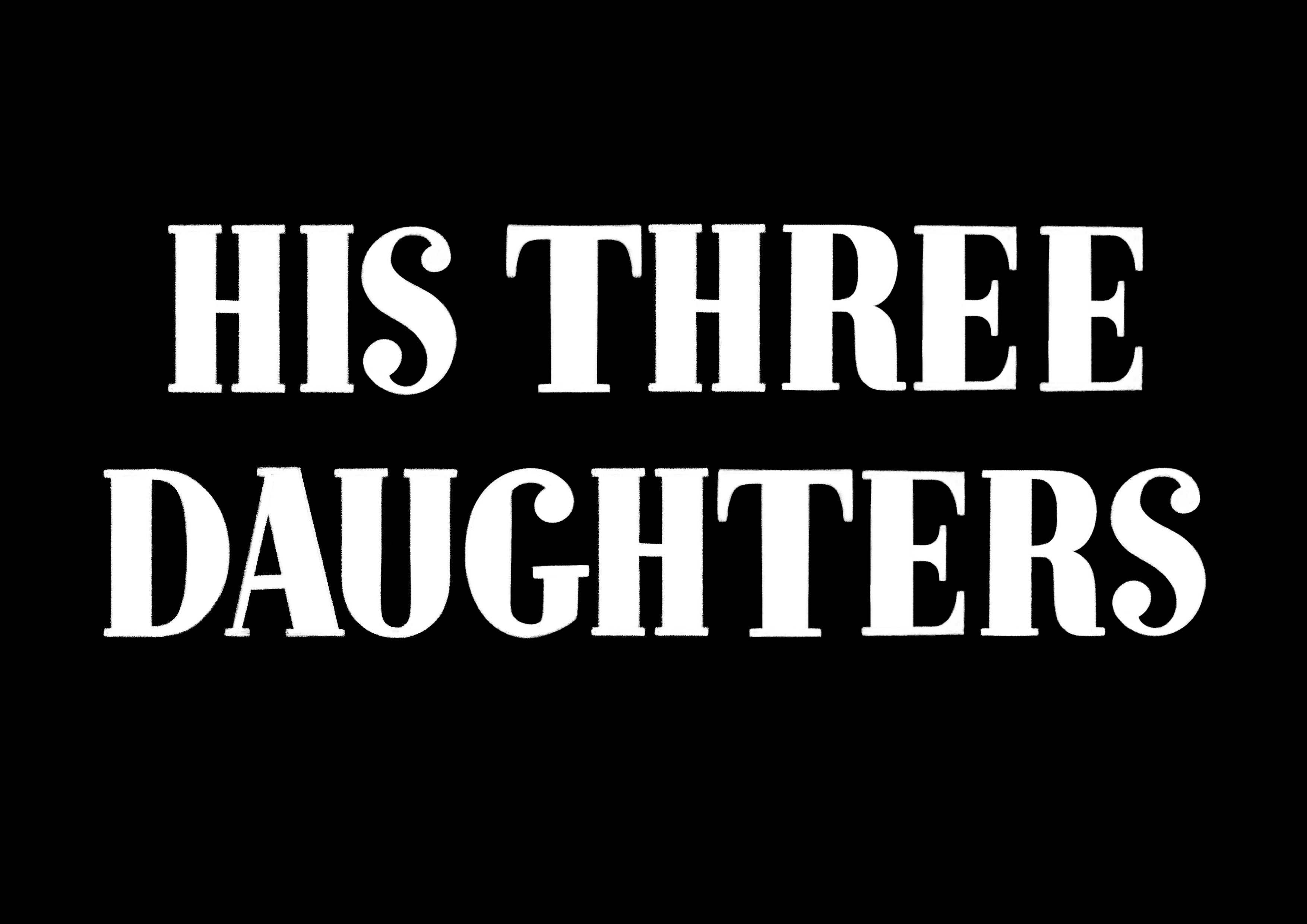
So, fuelled by the familiar terror of a short deadline I dug into sketching as many different lettering approaches as I could think of, trying to span as wide a range of tones as possible.
All of my sketches were inspired by researching title cards from the 30s and 40s. I would find something I liked, imitate some of the letterforms and then expand the alphabet to cover all of the letters I needed, tweaking the shapes as I went.

I can’t pretend that Azazel wasn’t taking quite a leap of faith in hiring me for this job, because he definitely was. I love working on lettering but it only comes up occasionally in my illustration work - more often in personal projects. Thankfully years of typeface fandom, the odd bit of calligraphy practice and that one time I got 98% in an online kerning game carried me past any pesky self doubts.
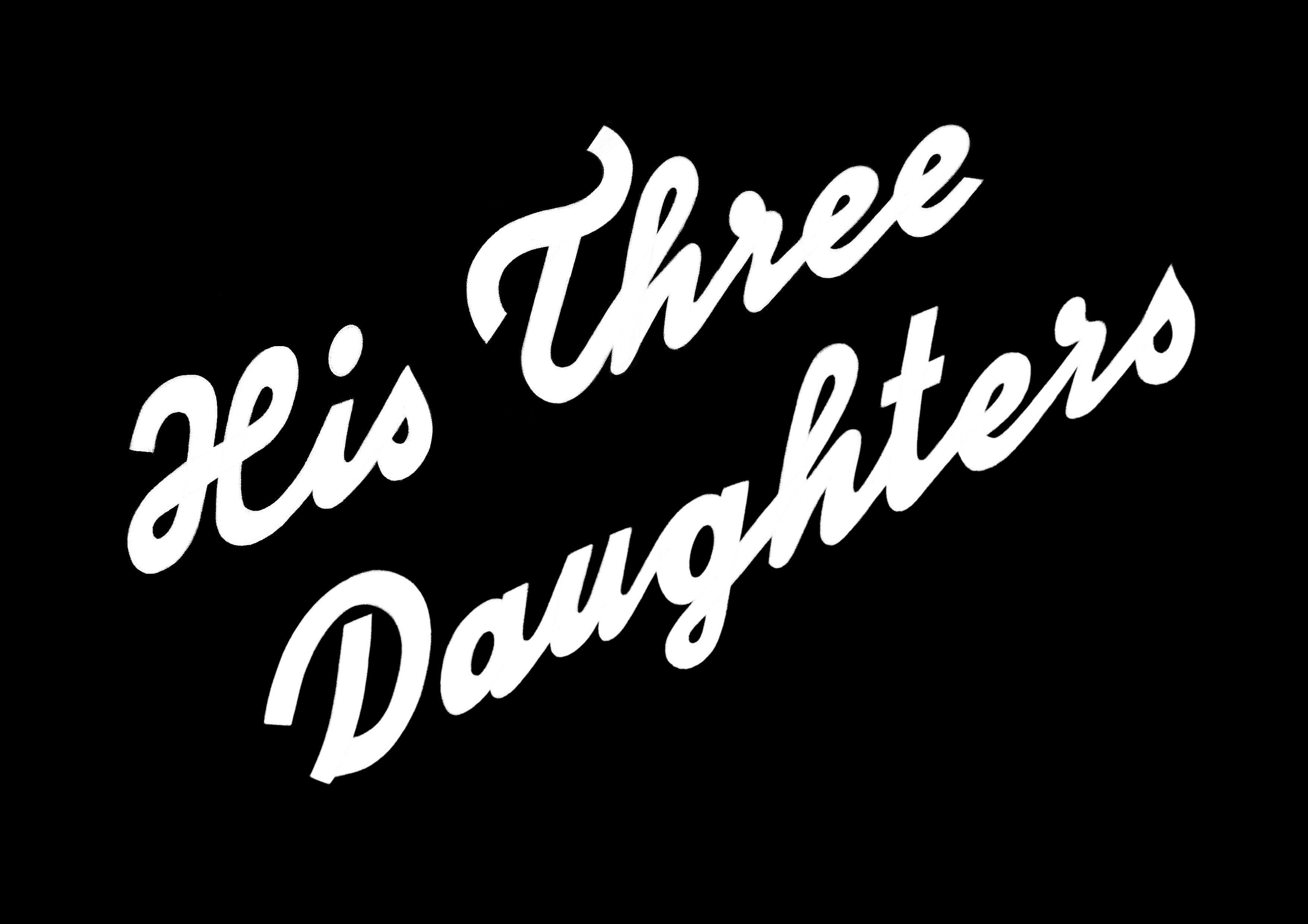
Figuring out what visual rules to impose on each sketch and how to balance letterforms in a harmonious (and legible) way was endlessly enjoyable, especially with such a vast pool of inspiration to draw from.
By the way - I can’t think of a better way to dip into the vast pool that is (American) cinema than with Martin Scorsese in his Personal Journey Through American Movies, watch Part 1 here.
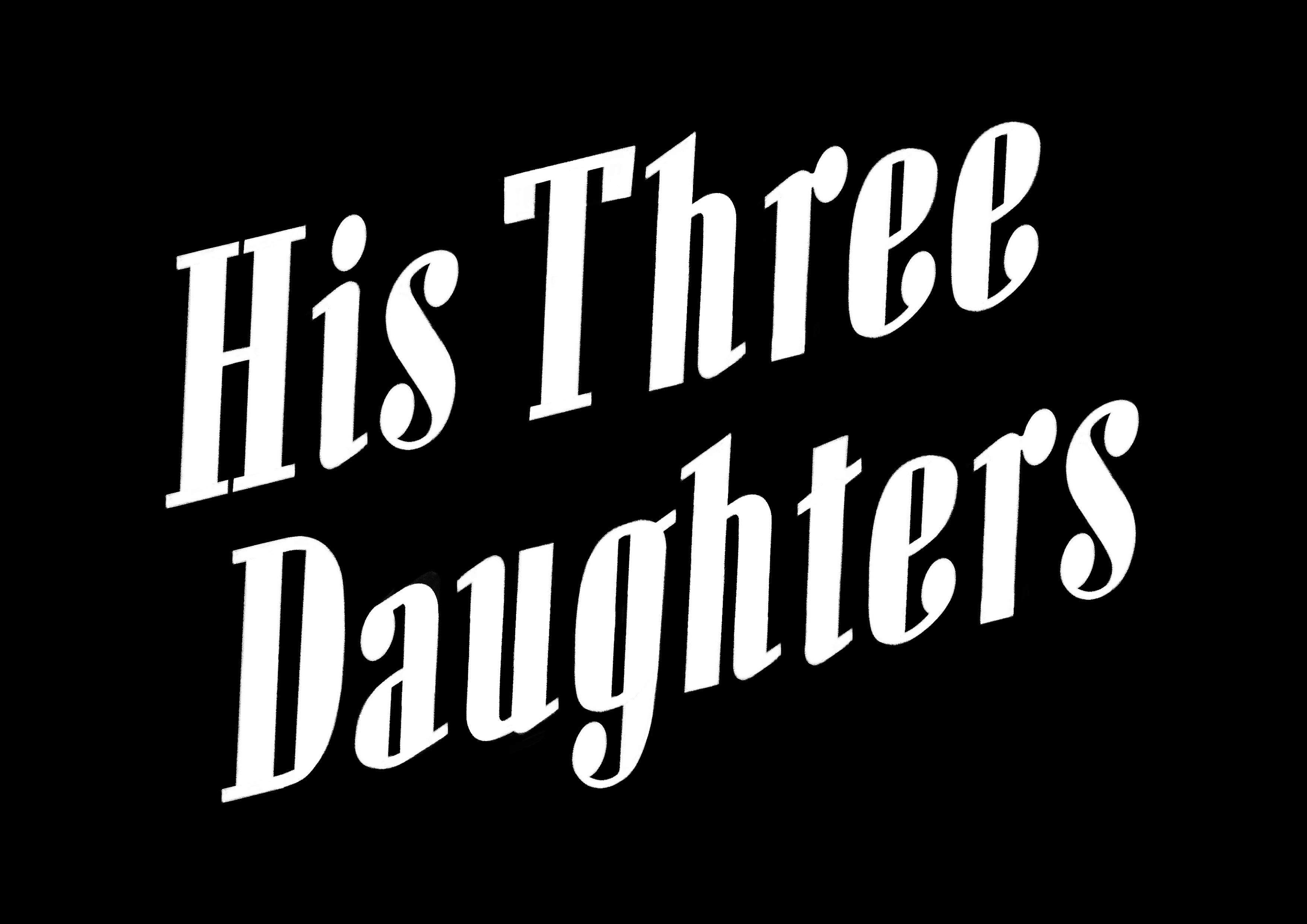
Here’s the inspiration behind the final lettering, which inspired me to take the typography into a starker and sharper direction than a lot of the other, jauntier sketches:
I often have movies like this playing on YouTube while I work. They make for a comforting sountrack and among the more forgettable Quota Quickies and B (or C) movies there are plenty of gems to discover.
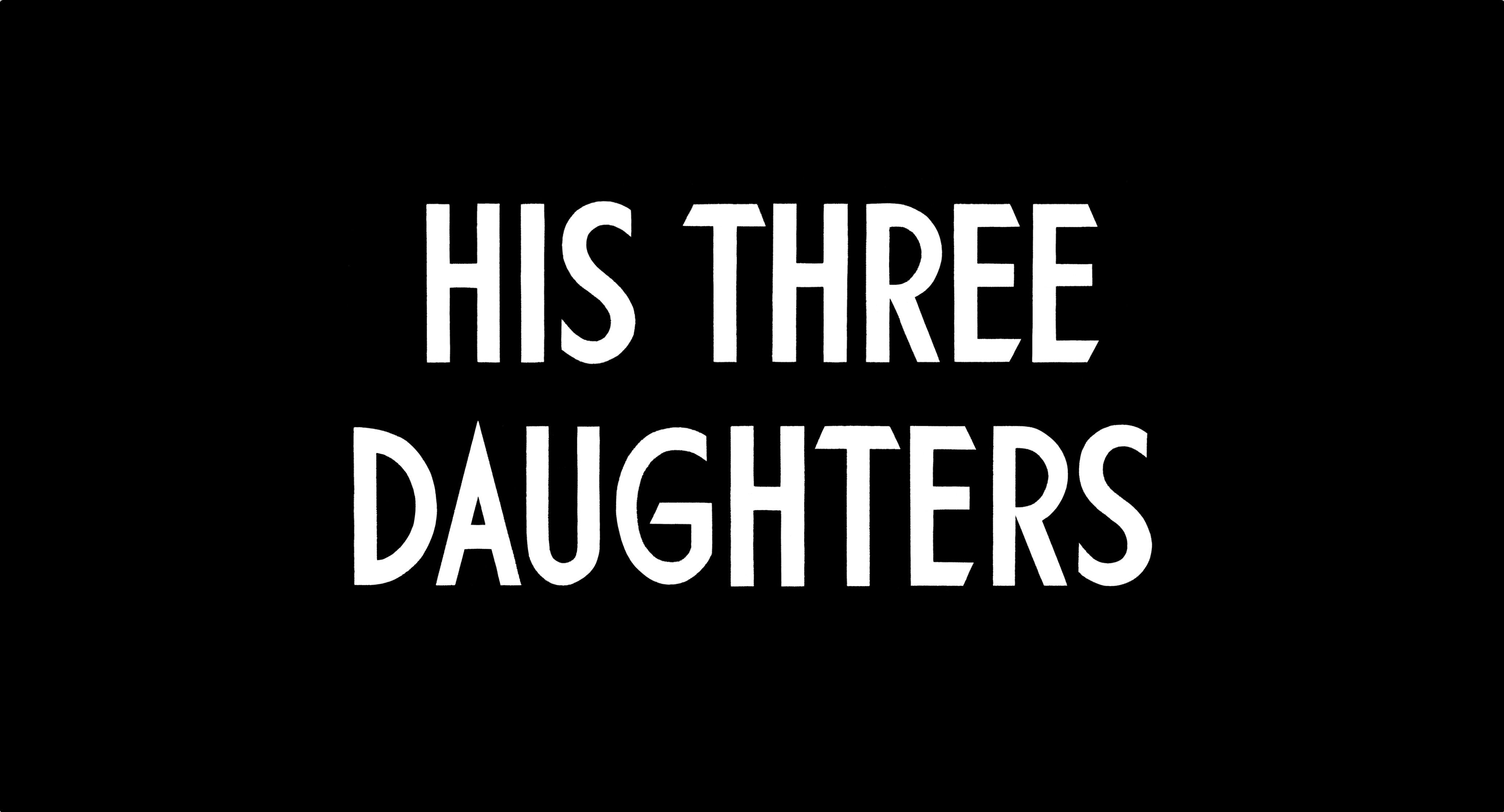
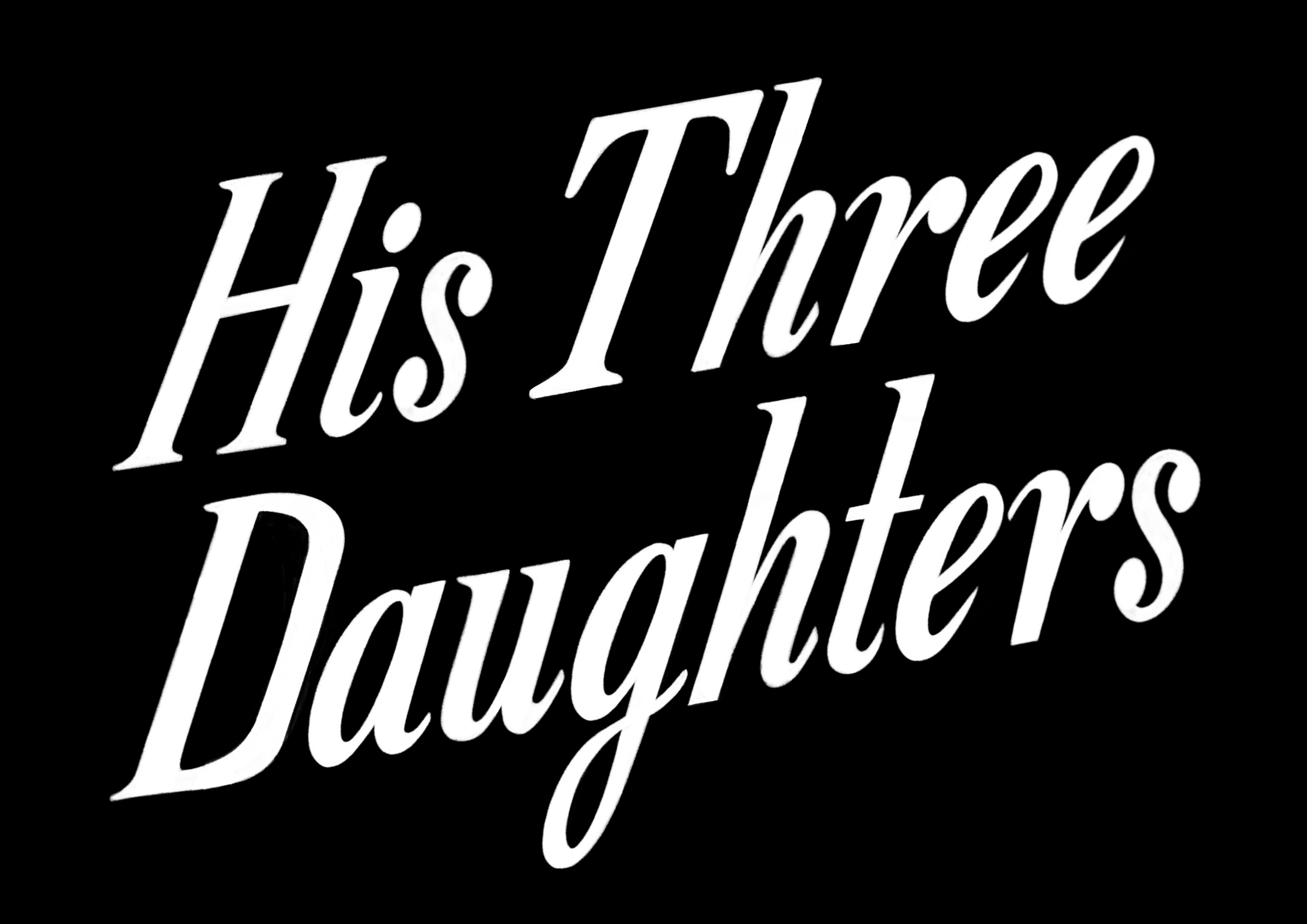
Here’s the final lettering. I left out the drop shadow from the original typography and fiddled with the overall look until it felt just right - informed by all of the inspiration but not overly retro or pastiche-y.
Huge thanks to Azazel for entrusting me with this dream job.
His Three Daughters will be in cinemas from September 6th and on Netflix from September 20th. I can’t wait to see it.
You can find Azazel on Instagram here, listen to him on WTF with Marc Maron here, see his Criterion Collection Top Ten here, and most importantly look up his movies here.
So good! 🖤
Omg Eleni how thrilling! I have been looking forward to this film and even more now. Love to see your process through different designs